Irina Koryagina is a designer in New York.
About
Email
New 42 brand identity
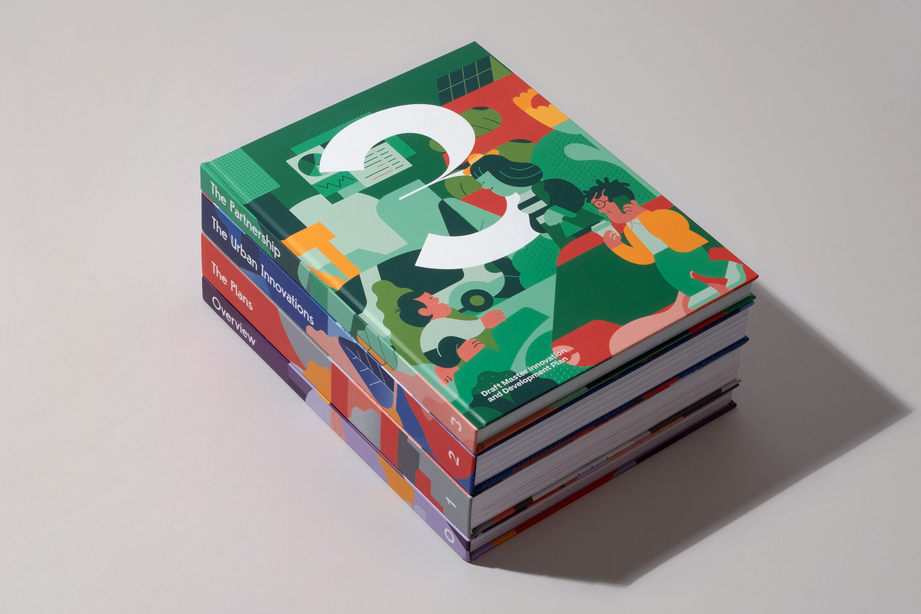
Sidewalk Labs’ Toronto Tomorrow master plan
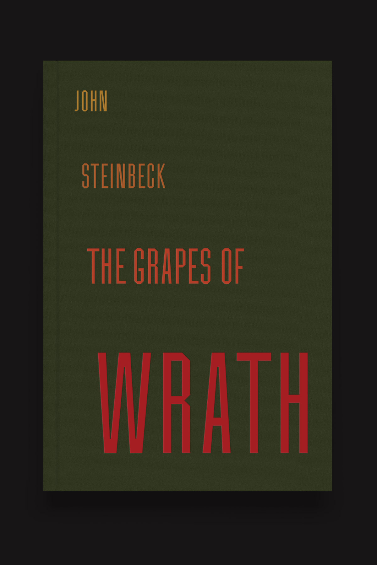
And Then You Read
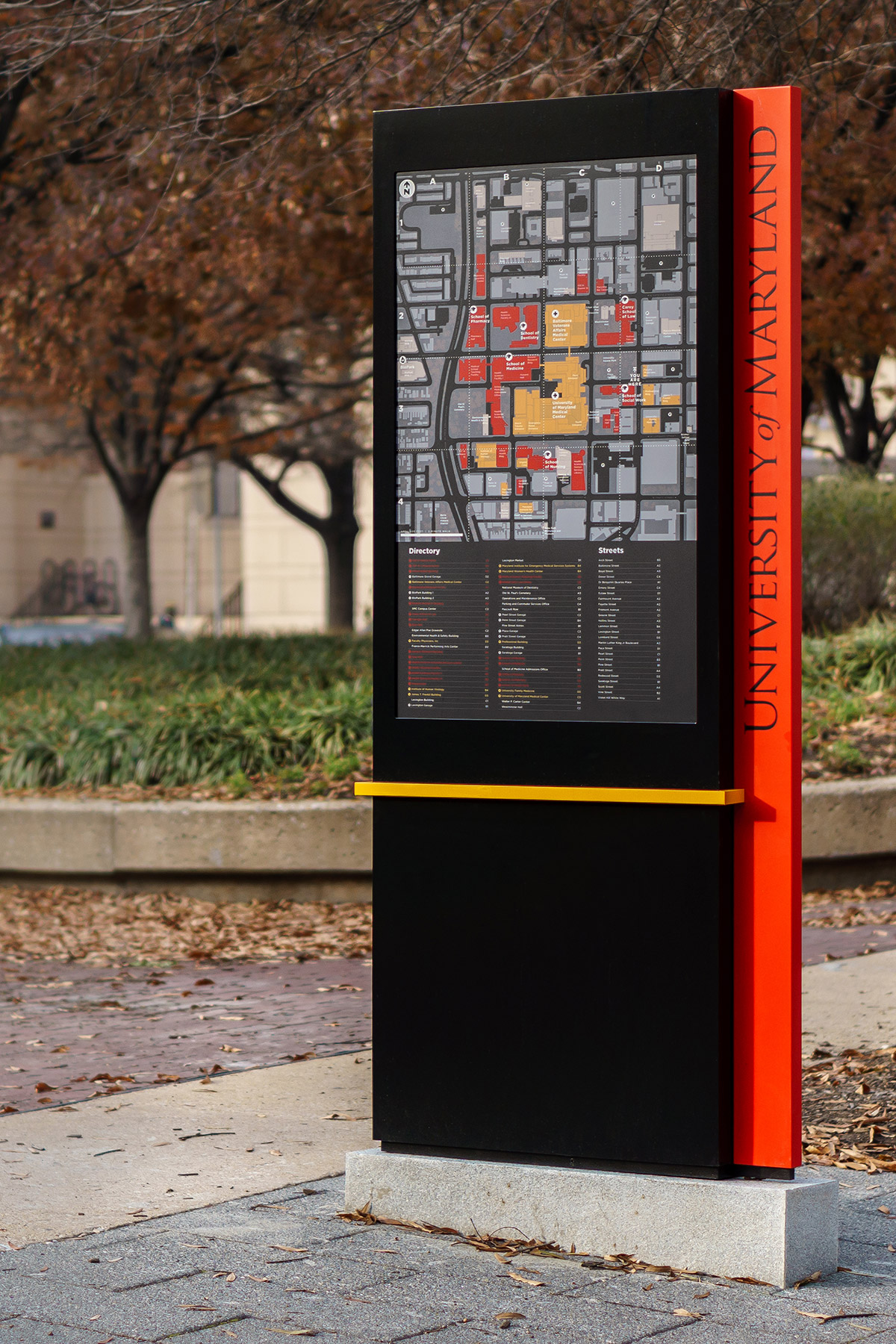
Mapping for The University of Maryland
Logotypes
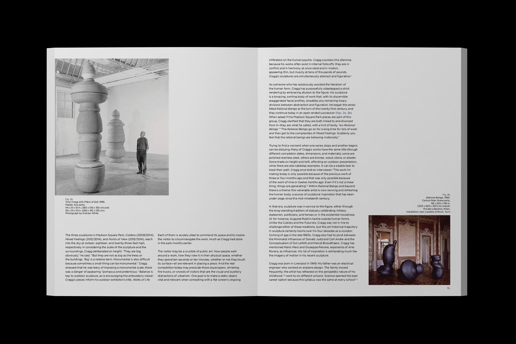
Madison Square Park art program exhibition catalogs
Jazz at Lincoln Center signage
Typefaces
Olin Library exhibits at Washington University in St. Louis
The New School brand collateral
The New York Times Book Review Russia issue cover
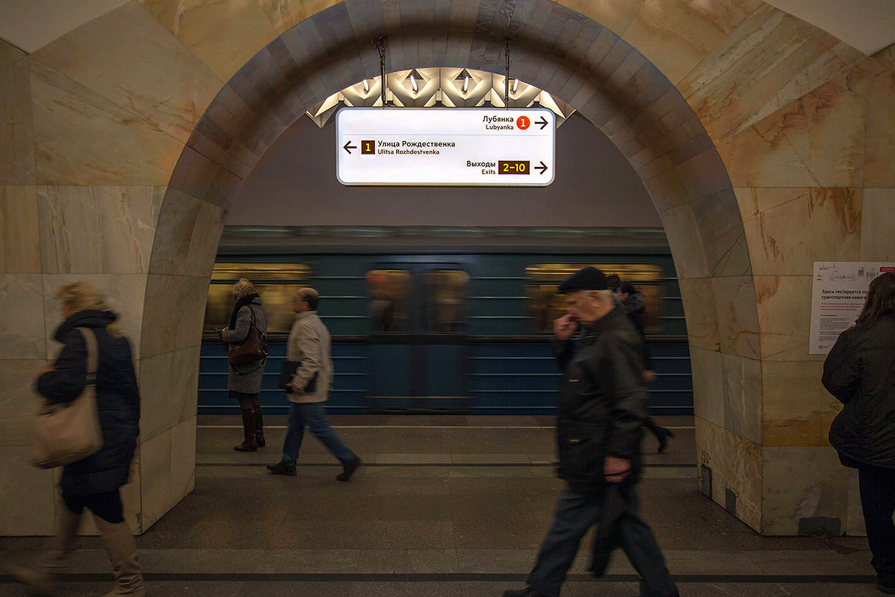
Wayfinding for Moscow
Memorial brand identity
Environmental graphics at Le Méridien Dania Beach